
Trading App Landing Page Concept
Case Study
Main Target & CTA of the landing page
Objective: Encourage qualified experienced traders to engage with the Trading App platform and switch over.
• Convert experienced traders
• Establish trust & performance
Primary CTA: “Get Started” (or potentially “Start the Challenge”) - this invites immediate action, aligns with the idea of stepping into something new and serious.
Secondary CTA: “Learn More” for those still doing evaluation.
Why “Get Started / Start the Challenge”:
It signals action, commitment, a next step rather than passive reading.
It aligns with the proposition of a trading platform + prop-trading style challenge.
It distinguishes from “just browse” → you want them to take the first leap.
Target Group
Who they are:
30+ experienced traders
Skilled, platform‑savvy
Value clarity & trust
Hate flashy hype trading sites
Want pro‑grade environment


Behaviour & Lifestyle:
Their day begins early: checking global markets (Asia open), news, analytics. Possibly they have a full-time job or have moved into part-time/trading as primary income or serious hobby.
In their free time: reading market commentary, webinars, networking with other experienced traders, evaluating new tools/software. Might travel, spend family time, but keep one eye on markets.
Pain Points:
Existing platforms may feel bloated, slow, marketing-heavy, less focused on serious execution. They may feel the need to switch because they want better conditions, better capital backing, fewer restrictions, more honesty.
What will catch their attention & motivate them to switch to Trading App:
Clear evidence of serious backing/funding model (not just flashy marketing).
Transparency: rules, payouts, platform speed, reliability.
Minimal gimmicks, no “get rich quick” nonsense - speak to their competence.
Efficiency & modern UI/UX that respects their experience (so not “dumbed down” but elevated).
A fresh visual feel (so it doesn’t feel like “yet another old platform”).
Demonstrated advantages: faster execution, better risk splits, real prop-trading backing, community of like-minded pros.
Competitors Research
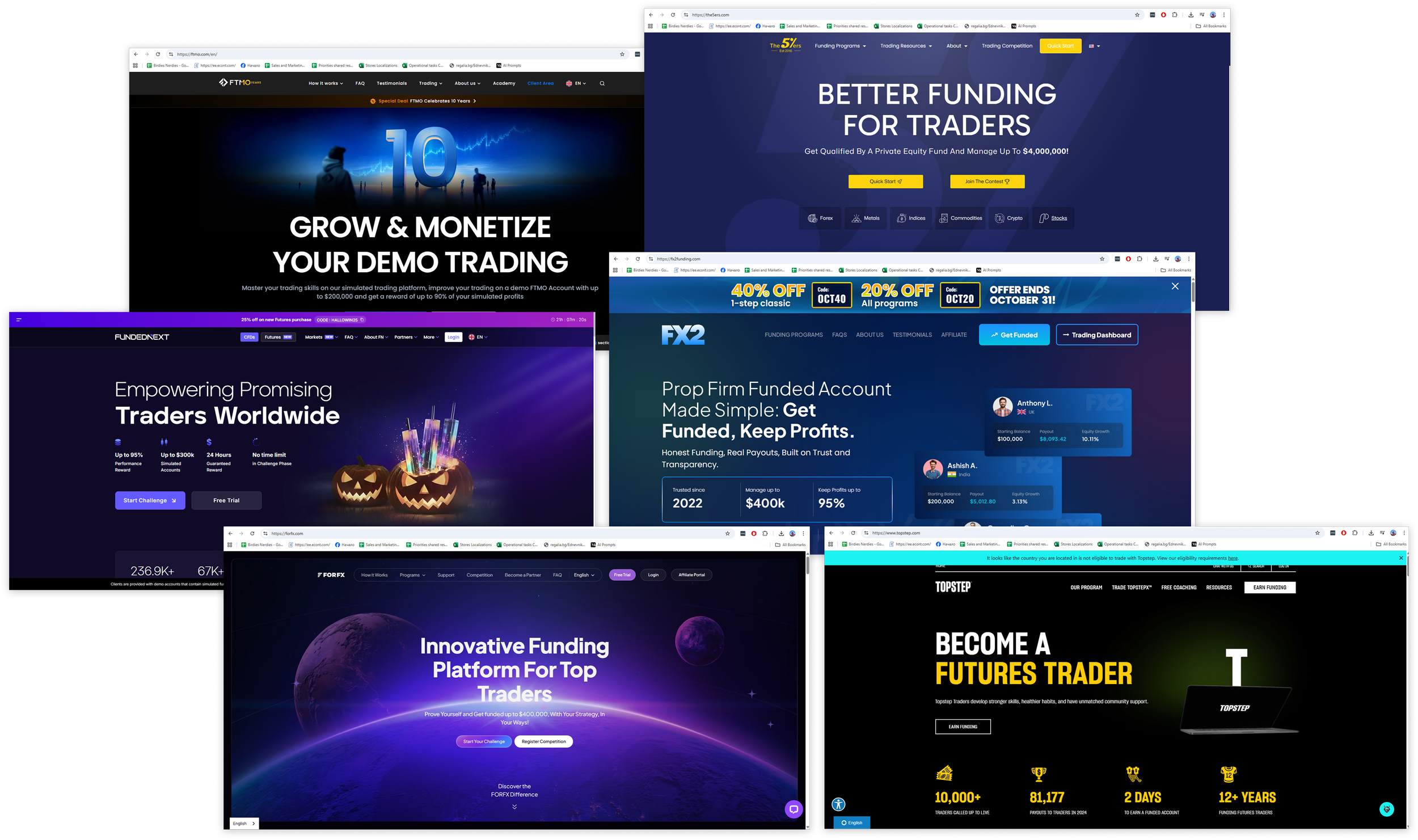
General Pattern & What’s Missing:
These sites tend to have glossy, high-impact hero visuals and big claims (profit splits, account sizes) rather than showing real trader presence.
There is relatively little imagery of real human community, real trader stories, “behind the scenes” authenticity.
Visual direction: heavy use of dark backgrounds, bold saturated colors, lots of gradients, tech-style effects rather than clean transparency.
For an experienced trader audience, many messaging pieces may feel generic or “salesy” rather than tailored to their deeper needs.
Competitors Research Summary
Competitors rely on:
• Dark glossy UI
• Marketing heavy visuals
• Minimal human authenticity
Opportunity: Calm, premium, transparent trading UX

Design Concept
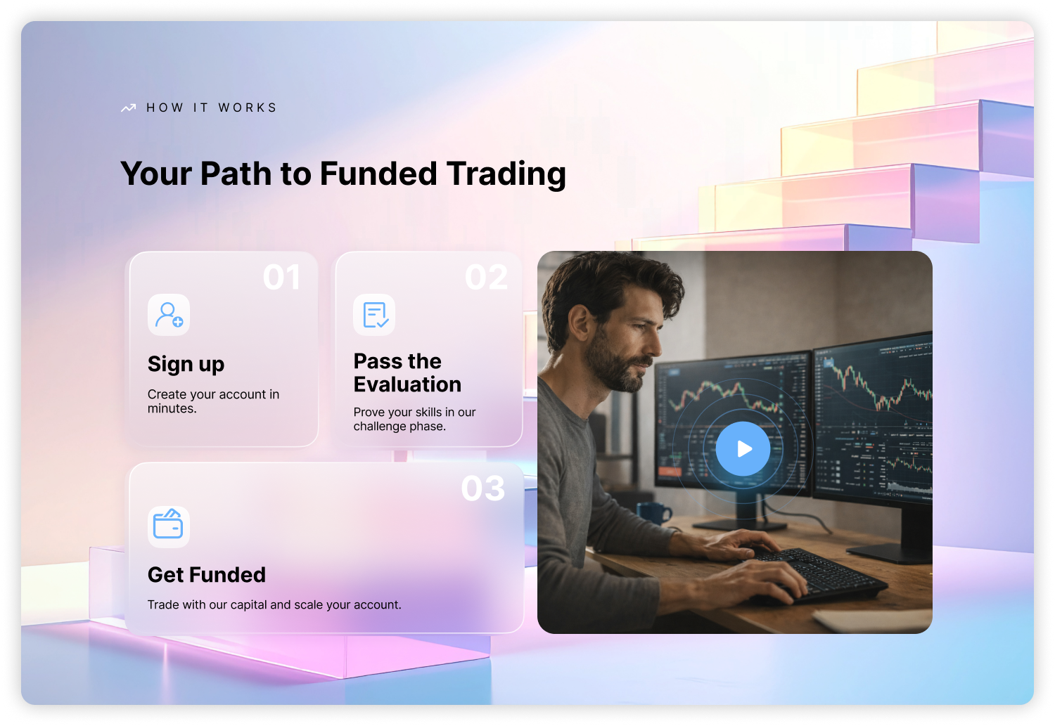
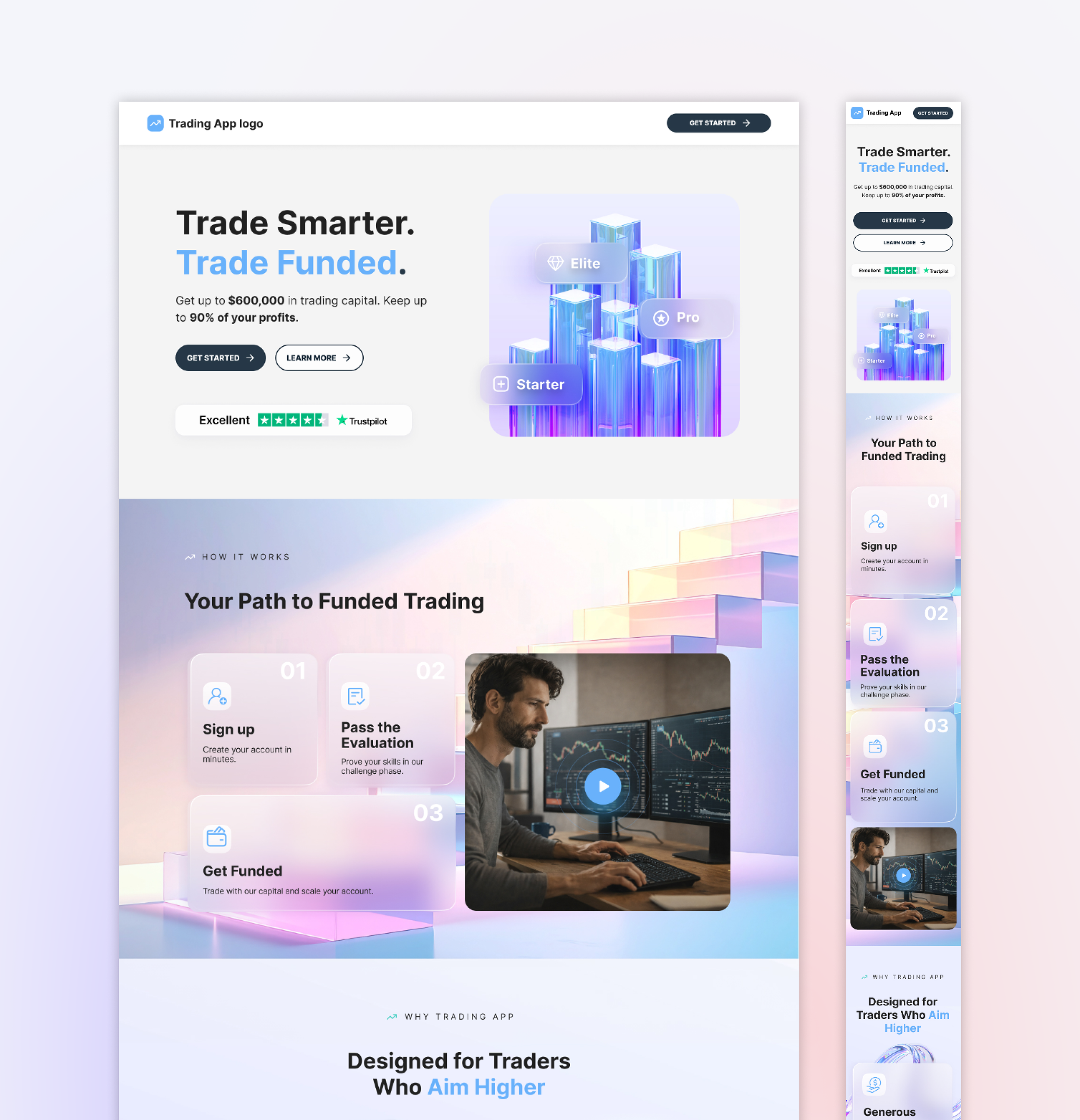
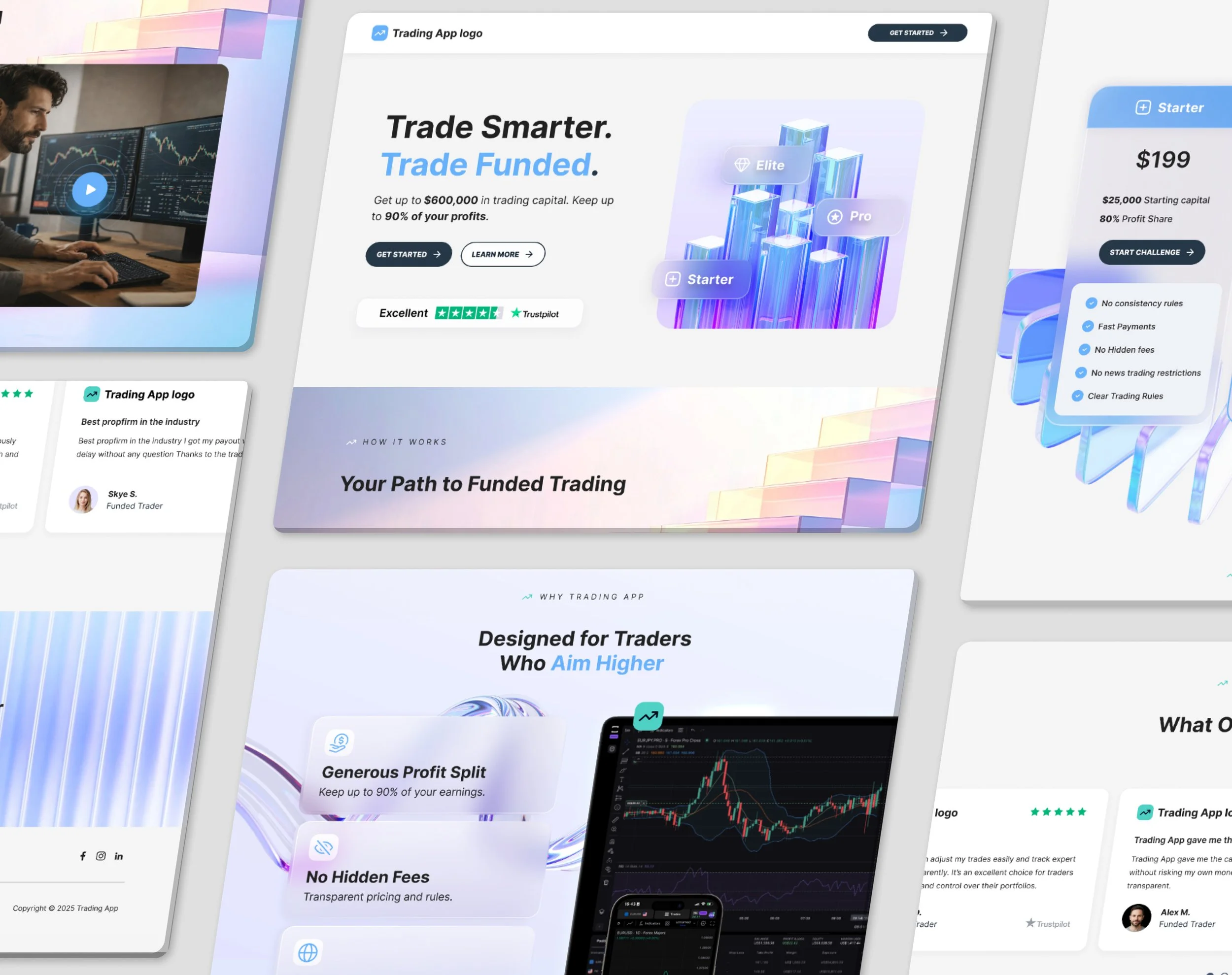
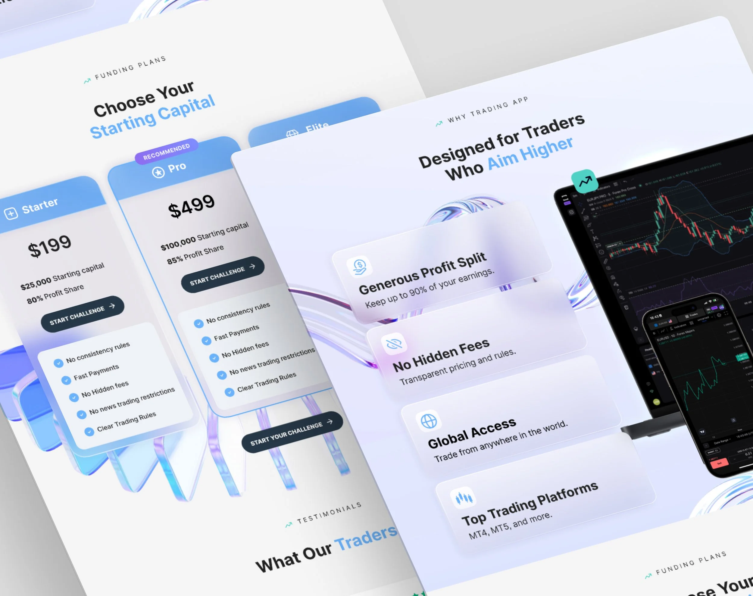
Page Structure
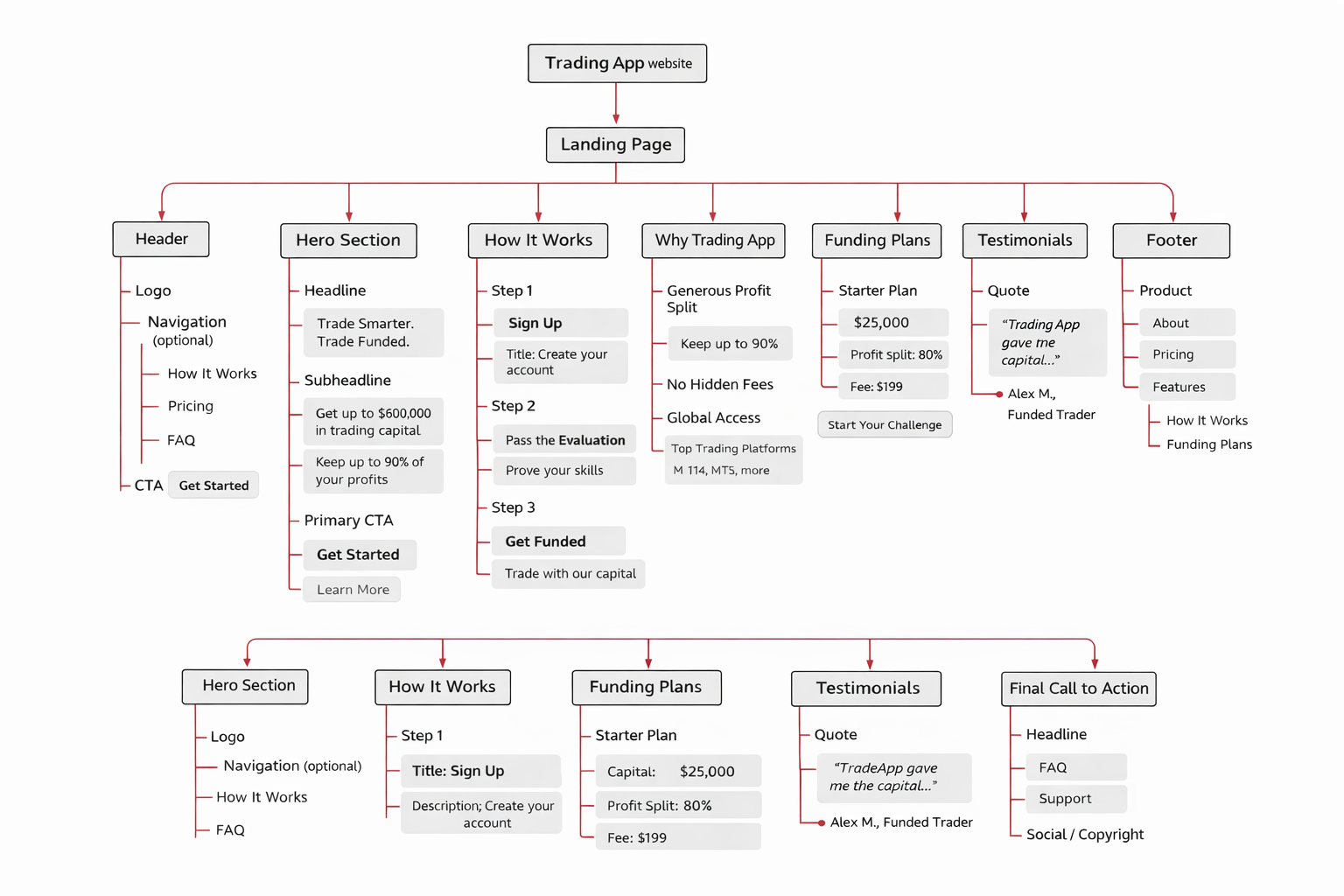
I have enriched the given structure with several elements that I believe would lead to better conversion on the landing page.
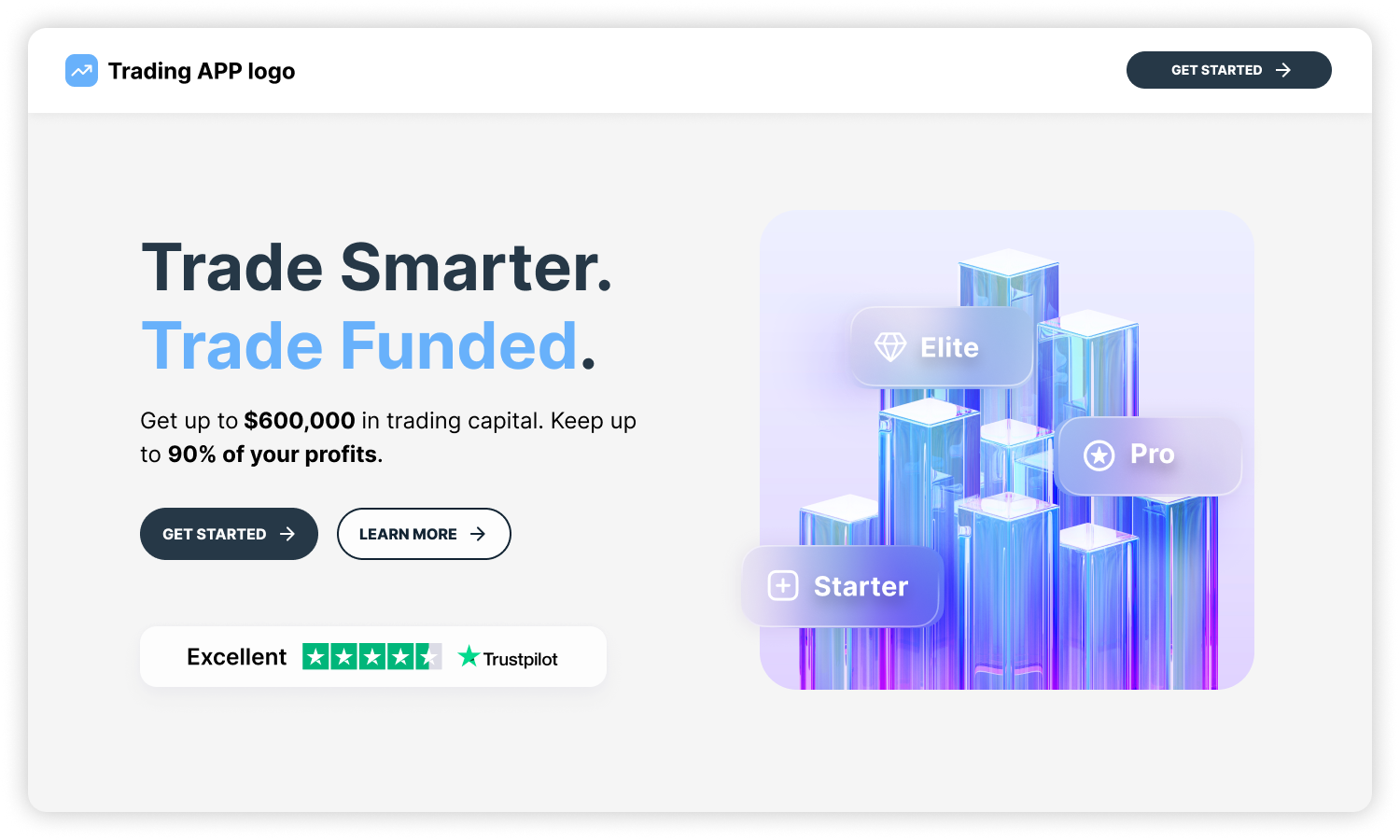
In the header I have added a "Get Started" button, which is visible at any time while the user is on the page.
In the Hero Section, just below the buttons, I have added an element displaying the TrustPilot logo and showing the user rating there. This is done for the purpose of social proof and creating more trust among users, since at the moment the startup has no other achievements, awards to boast of.
Publications feed could be added, which is also present on the current site.
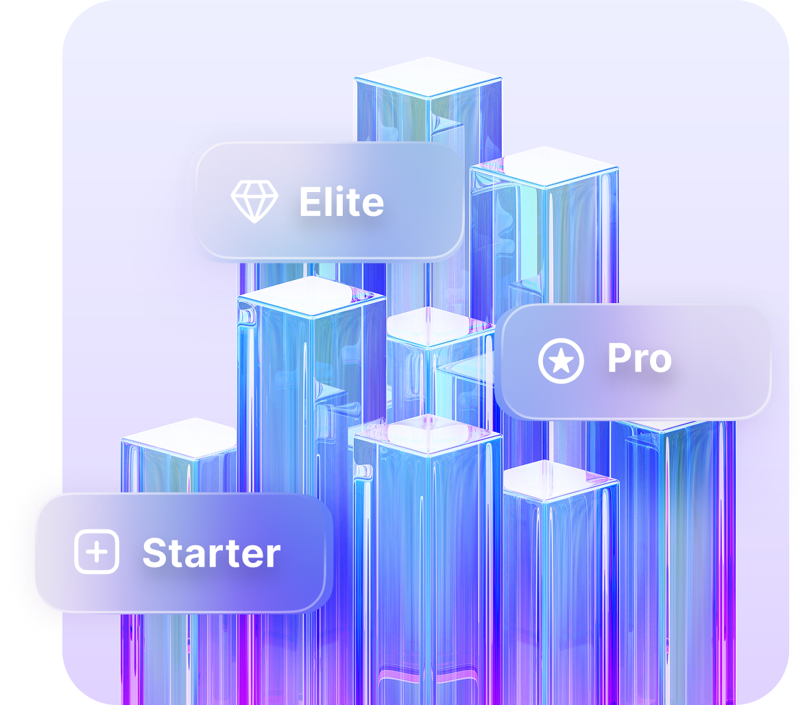
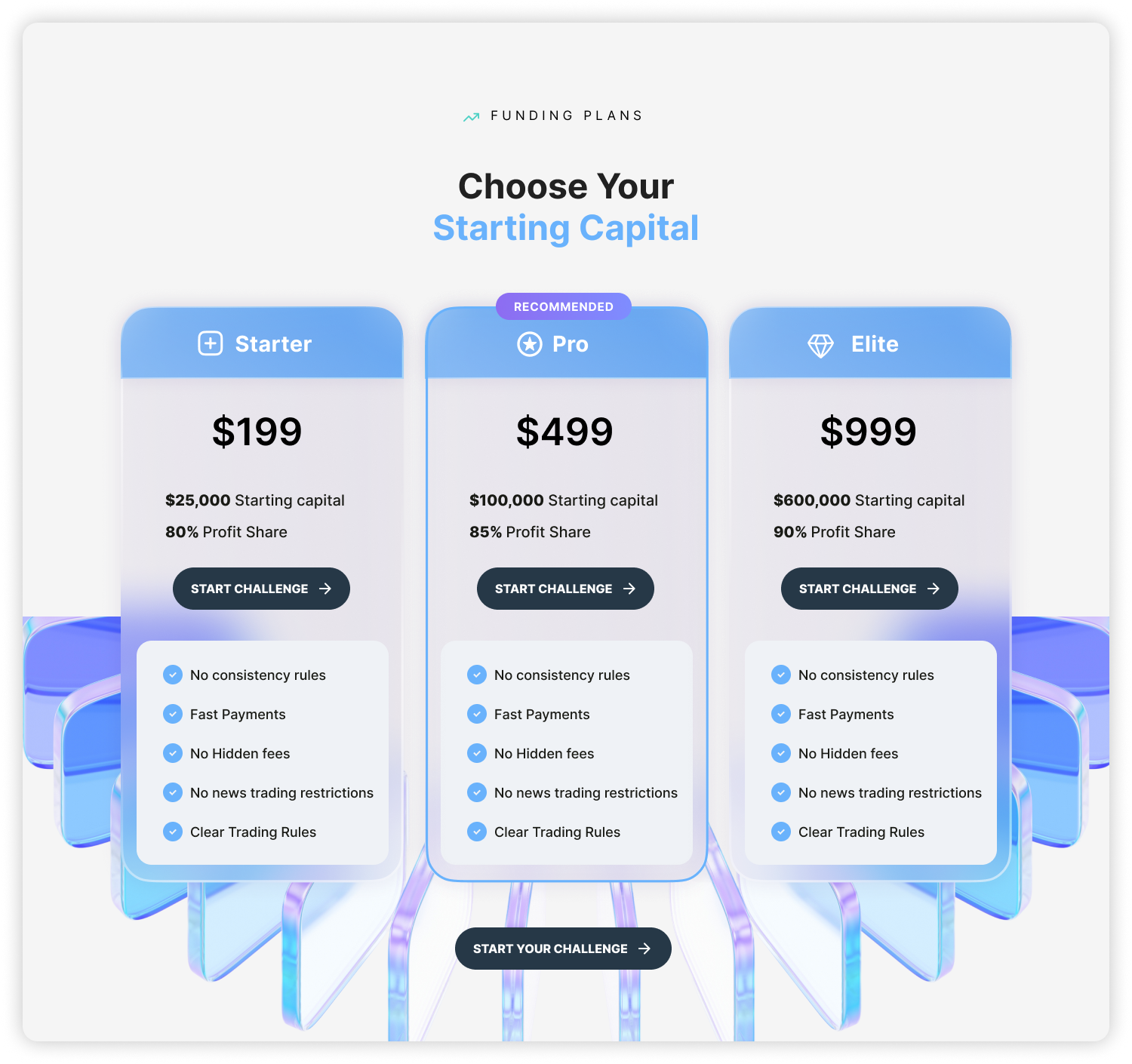
In the Pricing section, I have added icons to the names of the challenges to help you remember the name of the challenge, which are displayed in the Hero Image. These icons could appear on the trader's profile or avatar if there are rankings of who is doing well.
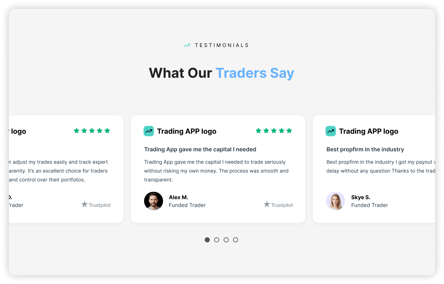
In the Testimonials section, I have added more than 1 review, taken from TrustPilot and selected so that they contribute even more to the authenticity and trust in Trading App.
Visual Direction
Our aim: position Trading App as not just another platform, but as modern, transparent, elevated, built for serious traders who demand clarity and efficiency.
By using a “light landing page” approach with translucent modern colors and shapes, we create a more open, premium, and fresh feel. The translucency echoes the idea of transparency in trading and funding.
Translucent modern colors/shapes: suggest fluidity, clarity, adaptability - analogous to the markets which are dynamic and ever-changing.

Dynamic shapes: represent the non-stop movement of markets, of price flows, of the prop-trading world. These organic shapes keep the page feeling alive and in motion.
Overhaul feeling / overall mood: The landing gives a sense of elevation, refinement, serious speed. It feels like stepping into a next-gen trading platform rather than a re-skinned website.
We aim for calm confidence. Instead of visual noise or gimmicks, there is elegance, movement, clarity. The user feels: “This is for me - a professional who knows what’s what.”
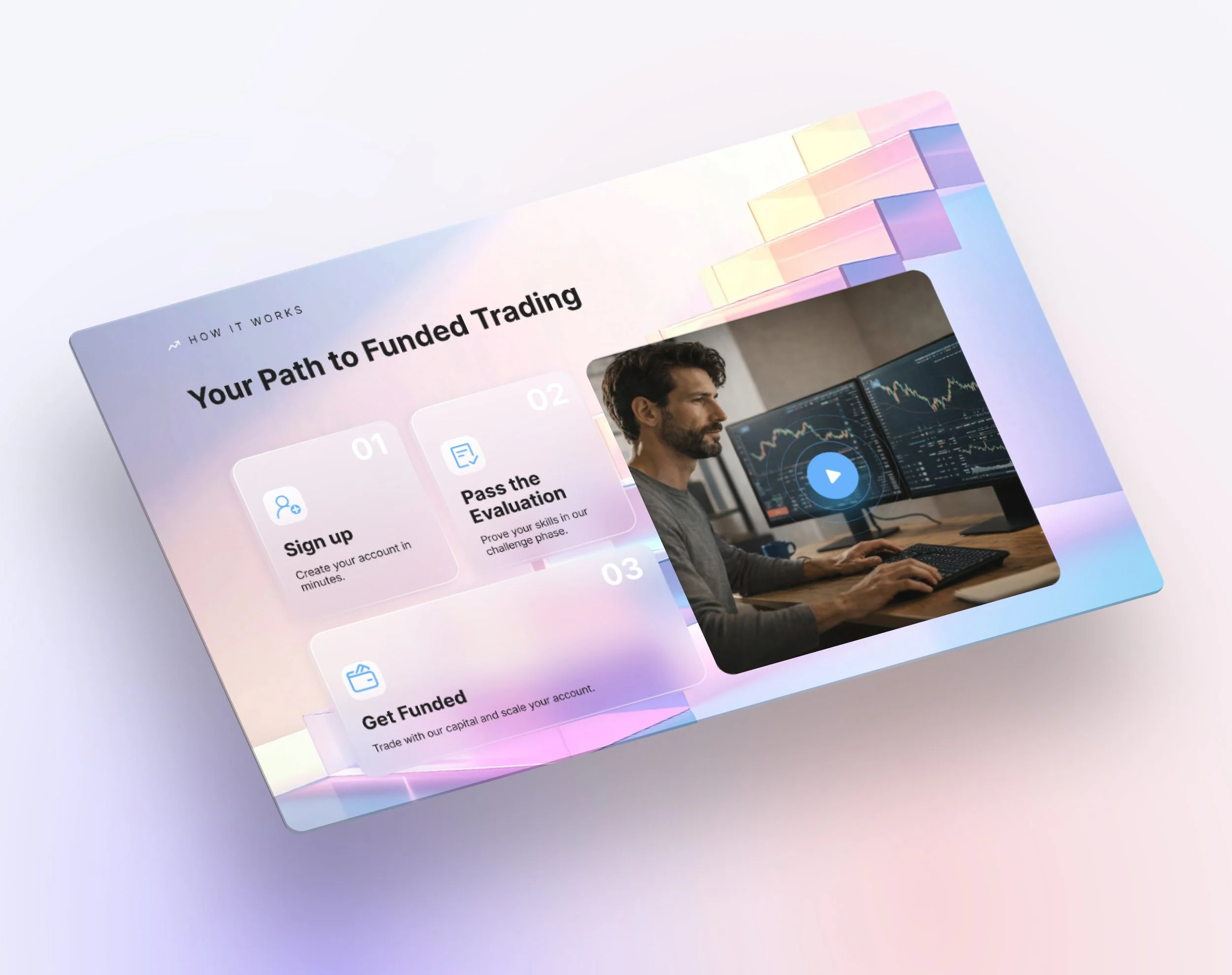
Animations & Interactions
Animations & Interactions
Animations & Interactions Animations & Interactions

To reinforce the modern and dynamic feel:
Hero section: On page load some of the translucent shapes slowly shift/slide, maybe rotate subtly, to suggest "markets never stop". The CTA button can have a subtle color-change or glow on hover to invite clicking.
Buttons: On hover they change color (or shade), adding a tactile feel. This micro-interaction signals “action ready”.
Section 2 (cards): The cards load one after the other in a gentle stagger (for example fade-in + slight upward motion). On mouse hover each card “pops up” a little (slight scale increase, shadow) giving an interactive feel.
Video: The video plays on click (not autoplay) so the user chooses to engage.
The Pricing section does not include any additional animations so as not to distract the user from important information. Buttons: On hover they change color (or shade), adding a tactile feel. This micro-interaction signals “action ready”.
In the Testimonials section, the user reviews are made into a carousel so that they can be displayed more and are convenient for visualization on the mobile version.

In the CTA section is added a animated background representing the non-stop movement of markets, of price flows, of the prop-trading world. These organic shapes keep the page feeling alive and in motion.
Color Palette
The new palette uses lighter and more translucent tones – less heavy blacks/dark gradients, more openness.
In contrast to many competitor sites which lean dark/heavy/flashy, this palette differentiates the Trading App visually and emotionally.
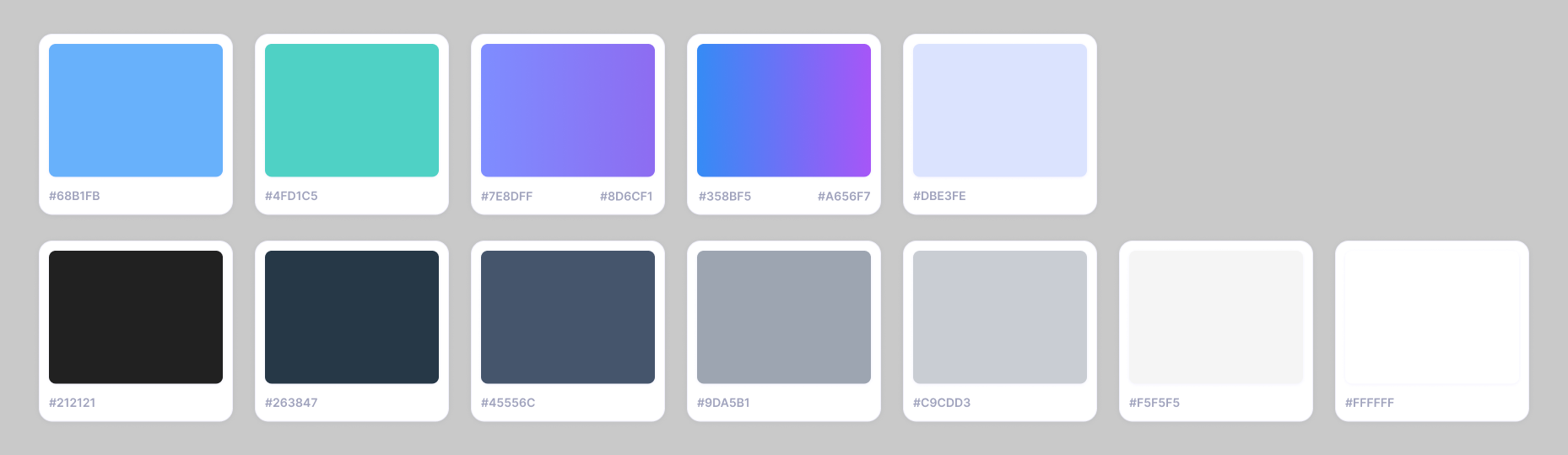
Why this palette:
It communicates modernity, clarity, and readability - important for experienced users who don’t want clutter.
The translucency and soft colors allow content and data to stand out rather than being overshadowed by heavy backgrounds.
It helps the landing feel more approachable and premium rather than “hyped”.
It supports the dynamic shapes and animations without visual fatigue - the colors serve as subtle context rather than competing with content.

Responsive Look & Feel
👉 Interested in working together on a similar project?